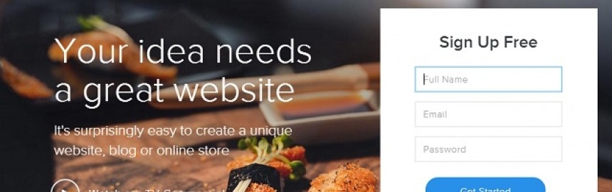
Here's a quick step-by-step, beginner's guide to making a free website (start for free, or choose from their low-cost paid plans) using Weebly - one
SME Pals is reader-supported. When you buy through links on our site, we may earn an affiliate commission. Learn more.

How to Make Old HTML Tables Responsive
Mobile first, responsive Web design is something that can't be ignored because devices likes tablets and smartphones are quickly becoming the dominant browsing device of choice for the burgeoning millennial market.
If you are one of those unlucky people to have built your site more than a few years ago, on a platform that used the old table based Web design paradigm, then you have two choices:

- Upgrade with a responsive site builder
- Upgrade your design to be responsive using media queries and CSS3
Option 1 is really the recommended route because you only have to upgrade once and your site will automatically enjoy round the clock upgrades as the site builder teams compete to stay in front.
But, if like me, you find that there's no way around using old style HTML tables, then option 2 is the only way forward. Fortunately, it's actually quite easy to mimic responsiveness. And here's how...
HTML tables
Tables are a nice way to display tabular information - like finance reports. Unfortunately, they are structured and designed with this in mind and come with some severe limitations in terms of what one can do with their layout.
A table, in general, consists of rows and cells and looks something like this in the HTML code:
<table>
  <tr>
    <th>Column 1</th><th>Column 2</th><th>Column 3</th>
  </tr>
  <tr>
    <td>Value 1</td><td>Value 2</td><td>Value 3</td>
  </tr>
</table>
which looks a bit like this when rendered on a page:
| Column 1 | Column 2 | Column 3 |
|---|---|---|
| This is the value of the first cell and if the text is long it can look really bad and awkward on a mobile device because the text simply scrolls down the page in a narrow column instead of spreading out to fill the whole page. | This is the value of the second cell and if the text is long it can look really bad and awkward on a mobile device because the text simply scrolls down the page in a narrow column instead of spreading out to fill the whole page. | This is the value of the third cell and if the text is long it can look really bad and awkward on a mobile device because the text simply scrolls down the page in a narrow column instead of spreading out to fill the whole page. |
To see why HTML tables are so unfriendly when it comes to responsive design, make your browser narrower and narrower while watching the content in the above table.
Since the table has no knowledge of mobile page design it keeps its structure the whole time and this can end up making things really unattractive and awkward to read on a smaller device.
Ideally, we would want the layout of the table to change once the screen gets too small so that the left hand column appears on top, across the entire width of the screen. The second and third columns would become the second and third rows respectively.
But HTML tables have no native way of doing this...
CSS3 and media queries
Fortunately, there is a trick we can use in our stylesheets that will change the layout of the table in exactly the right way based on the dimensions of the browsing device. In fact, I have already done this on SME Pals for our small business ideas resource page.
A table is perfect for the layout of the ideas in a large screen (like a PC) and looks like this on a PC:

But, like our table shown above, the content can get squashed unless the table can automagically re-arrange itself to allow each cell access to the full width of the screen. On a mobile device the table looks like this:
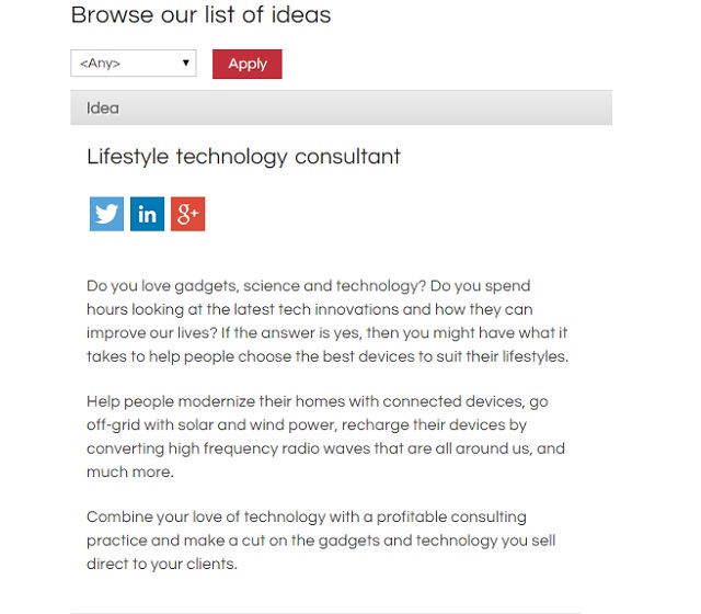
Note that the idea title and share buttons now appear above the description instead of in the same row. This means that the description isn't squeezed into half the table as the screen narrows down to smartphone width.
As it turns out, the process is super easy. All that is required is a quick change to your stylesheet, within a media query, as follows:
@media only screen and (max-width: 991px) {

.small-business-ideas table tr td{
  display:block;
  clear:both;
  width: 95%;
}

...

}
Obviously, you would need to alter the above code to apply to a particular table(s) on your own site. In our case, the above declaration box used a class selector to specify our "small business ideas" table.
In particular, the above declaration forces the individual table cells to:
- fill 95% width of the page
- appear beneath earlier page elements
- but only when the screen is less than 991px in width (this comes from the media query)
The net effect of this is to convert the table into what appears to be a responsive design that fits the screen beautifully. We can apply this effect to the three column table from earlier in the article so that it behaves responsively, as shown here (Hint: resize the width of your browser to see how the layout responds):
| This is the value of the first cell and if the text is long it can look really bad and awkward on a mobile device because the text simply scrolls down the page in a narrow column instead of spreading out to fill the whole page. | This is the value of the second cell and if the text is long it can look really bad and awkward on a mobile device because the text simply scrolls down the page in a narrow column instead of spreading out to fill the whole page. | This is the value of the third cell and if the text is long it can look really bad and awkward on a mobile device because the text simply scrolls down the page in a narrow column instead of spreading out to fill the whole page. |
Responsive Trick: Show & Hide Table Columns
You can also hide less important columns by giving them a class name (i.e. responsive-column1, responsive-column2, etc) and using CSS media queries to hide those columns - using display:none; - as the screen width shrinks.
If you aren't already using media queries and CSS3 then I recommend you spend a bit of time learning about each. Here are a few resources to help you out:
Remember that this is a useful hack to help you in the short term, if there is no other option. But fundamentally, table based layouts are old, redundant, inflexible, and make many browsers feel bad.
Hopefully, you will now be able to use a clever combination of CSS3 and media queries to help make your site a bit more mobile friendly. But, if your site is designed using tables, it's time to upgrade the whole thing to something newer and better.
Have you tried using CSS3 media queries? Did they do the trick, or are you still stuck with a rigid design? Share your tips and experiences upgrading to a mobile friendly platform in the comments below.

One of the key factors in the success of any eCommerce site is great marketing - and email is one of the most effective of all Internet marketing strategies.

Good Web design is important for success online, but big companies implement bad design all the time.

Compare and rank the best website builders (all free to start and cheap to maintain) on everything from responsive design, to SEO, value for money a

We've researched and compared each of the three leading eCommerce website builders to highlight which ones are the most popular, offer the best value for mon

Well managed 404 "file not found" errors can turn potential problems into great opportunities that help you get the most from Web traffic that might otherwise slip between the cracks.
Even if visitors are trying to find content that no longer exists, a good 404 error page can direct them to the information they are after and lead to a conversion - just like any other good landing page.
Makes sense right? Just because a visitor is after a non-existent page (perhaps they have been directed to a mistyped URL from another site) doesn't mean we can't try give them what they're after anyway.

Website builders have forever changed the world of Web design by allowing us to use free, responsive themes and templates to manage the look and feel of our

Are you looking for dedicated server hosting for your blog or business website, and want a comparison table of the best plans from leading Web hosts to help

Wix is one of the world's best online website builders with over 150 million sites created, and you can get setup for free in minutes by foll

See how Shopify makes it quick and easy to design, build and host your own cutting-edge, responsive online store/boutique.

Having a basic knowledge of HTML (HyperText Markup Language) can be a huge help for bloggers, online entrepreneurs, or anyone who might be asked to

Learn how to create the perfect website for free with great design and functionality that's super easy to maintain and cheap to operate.