

Having a basic knowledge of HTML (HyperText Markup Language) can be a huge help for bloggers, online entrepreneurs, or anyone who might be asked to
SME Pals is reader-supported. When you buy through links on our site, we may earn an affiliate commission. Learn more.

5 top UX Web design tips
User eXperience (UX) plays a vital role in how well your site converts traffic, and we've got some interesting Web design tips that will give your visitors a better experience while maximizing your profits.
By thinking carefully about how traffic flows around a site, and what visitors are after at any given point (i.e. user intent), it's possible to make relatively small design tweaks that have a massive impact.
Remember that great UX has plenty of knock on benefits because a happy visitor is not only someone who converts (i.e. signing up to a newsletter, or making a purchase), but also someone who recommends your site, shares articles, and becomes a loyal fan.
1. Killer "Page not found" pages
It happens. Look in the logs of any site in the world, and there will be a number of 404 page not found entries.
But just because you don't have the exact page someone is after doesn't mean you need to lose that visitor forever. Maybe they mistyped the URL, or someone else accidentally linked to the wrong page.
Wouldn't it be great if you could work out what that person wanted, and deliver it anyway? Well, take a look at a typical 404 page on SME Pals:

What's interesting about this is that the URL has been used as search keywords to find the content a visitor is looking for.
In other words, instead of turning someone away by saying we can't find anything, we've provided them with information they are very likely looking for - turning a potential bounce, into a successful interaction.
2. Tip-top "Log off" pages
Having a client log out of your site doesn't mean it has to be the end of the interaction. Why not convert your log off pages into another call to action.
PayPal do this very well, by offering their clients a list of special deals on their own apps & partner services that are closely related. No doubt, this is beneficial to PayPal, but it is also useful for their users:

In other words, a log off page is a great chance to obtain another conversion, by offering add-on products and services, encouraging users to share socially, review the service, sign up to a newsletter, and so on.
3. Awesome "Out of stock" pages
Running out of stock is a bittersweet predicament to be in. Yes, you're losing revenue because you can't sell something you don't have, and no because you've probably made a bit of cash selling out in the first place.
But, just because an item is out of stock, doesn't mean you can't make a sale. Is more stock on the way? Why not let people pre-order the item and have it delivered when it arrives?
Alternatively, if your product page is driving traffic from referrals and Google search traffic, it's a waste to turn potential buyers away.
If you have alternative items they may be interested in, offer them. Or, if worst comes to worst, show them somewhere else it can be purchased (at least if it is Amazon you can make a few bucks in affiliate referral commission).
Talking of which, Amazon is pretty good at selling stuff it doesn't have (check the note at the bottom right of the screen):

They make it super easy to purchase something that is not available for 3 weeks still. But, there's no point in sending shoppers somewhere else, right?
4. Updated "Out of date" pages
It amazes me how many high traffic Web pages are years and years out of date. Yet Google dutifully ranks them at the top of search results because of their accumulated links, trust, and authority.
As someone who searches for online information all the time, there is nothing more frustrating than reading the top ranked result page only to find that it no longer applies.
As a blogger, webmaster, or online store owner, it is your responsibility to monitor your pages and update them when appropriate.
Now, I don't expect you have the time to constantly monitor pages and perform continuous updates, but at least check your top pages in Webmaster Tools or Analytics and keep those ones current.
And, what's more, updating content is super easy. It may be nothing more than adding a link to a newer article:

Updating pages (especially ones that drive valuable organic traffic) leads to improved trust and a more positive user experience.
5. No confusing clutter
We recently wrote an article on the top Web design fails that highlighted various ways companies make life difficult for their customers (by not considering them when it comes time to designing their Web platforms).
In most cases, the problem boils down to obscuring the purpose of the site/page, making it difficult for users to get what they're after (generally because they are trying to push ads down your throat).
If your design reflects the fact that the user comes first, then you won't run the risk of losing business when people become impatient or frustrated.
Design each page with a clear focus. If that page is part of a sales funnel, then make it clear what action the user is supposed to take next. Don't hide anything behind slow loading, flashy animations, interstitial ads, and other distractions.
So those are some of the more unusual UX Web design tips I had up my sleeve. What strategies have you used to improve the user experience on your own site?
Share your tips and ideas in the comments.

Website builders have forever changed the world of Web design by allowing us to use free, responsive themes and templates to manage the look and feel of our

Are you looking for dedicated server hosting for your blog or business website, and want a comparison table of the best plans from leading Web hosts to help

Good Web design is important for success online, but big companies implement bad design all the time.
Wix is one of the world's best online website builders with over 150 million sites created, and you can get setup for free in minutes by foll

There are a few main reasons why every Webmaster should be constantly on the lookout for ways to improve or upgrade their websites.
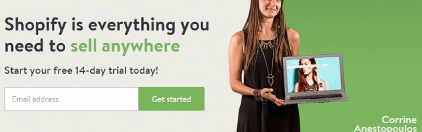
See how Shopify makes it quick and easy to design, build and host your own cutting-edge, responsive online store/boutique.

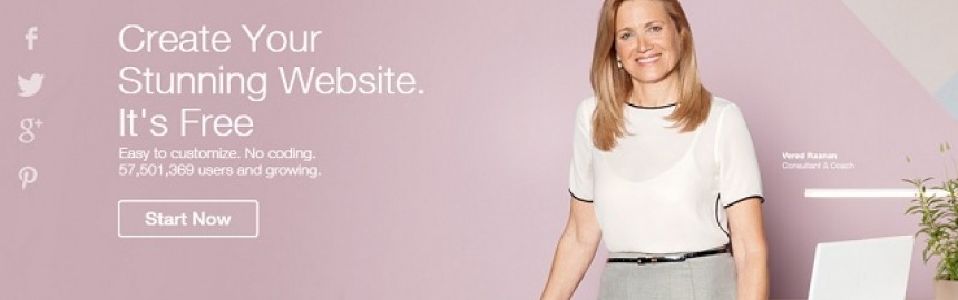
Learn how to create the perfect website for free with great design and functionality that's super easy to maintain and cheap to operate.

At some point, you're going to need to decide which of the most popular website builders (Wix or Weebly) to use for your own small business website.

We've researched and compared each of the three leading eCommerce website builders to highlight which ones are the most popular, offer the best value for mon

What features makes a website good can be a really subjective thing. What works for one might be complete poison for another.

Compare and rank the best website builders (all free to start and cheap to maintain) on everything from responsive design, to SEO, value for money a

